Designing Lighting Effects with Even-Temperament
- Mar 26
- 2 min read
This week I've gotten tremendously distracted experimenting with Hydra!
Hydra is a sister program to Strudel (the live coding platform I use for my live shows), designed specifically for video and visual effects. It's integrated into strudel too- so I can theoretically use the same code that runs my songs to control more complex visuals.
I've spent some time this week creating a project in hydra that reads from variables with the same names as those in my custom Strudel synth function. This new function is designed to function similarly to the visual tool I'm building in TouchDesigner that maps to the controls of my StudioLogic Sledge synth, via MIDI. There are lots of specific things I have done in this project that feel important to document/ that might be useful to other people/ projects in the future. The program, essentially, takes each note (1-12 tones) and maps them to a color swatch, then flashes that color on the screen using parameters from the synth's Amplitude or Cutoff envelope. This way, different pitches appear as different colors, and patterns in a melody or arpeggio will appear as a consistent visual pattern of colors, which looks great and feels natural. It also maps the brightness of the color to the synth's cutoff, so as the sound gets more intense, the light also becomes more intense.
A few months ago when I was working on my TouchDesigner project, I noticed that my color palette was behaving weirdly when certain notes triggered. Some colors were significantly brighter and more distracting than others. This happens because there is a natural inherent value differences between certain hues (most colors we perceive as yellow are quite bright, while most colors we perceive as purple are quite dark, etc...). Usually this is not a problem because different colors having different brightnesses is a natural visual phenomenon and it doesn't look strange to us. In my case, however, (where I want to control brightness very intentionally as a separate parameter conveying visual information) I needed a pallette that specifically compensates for these differences.
To do this, I used an LCH color tool like this one, designed specifically to help designers choose colors with consideration for lightness in mind. After a few iterations, I ended up with this palette of 12 swatches, equally distributed across the hue spectrum, and evenly matched on the value spectrum.
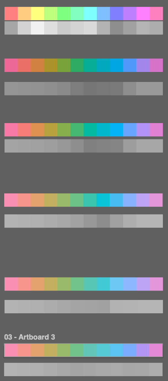
Below, each iteration of the pallet, I've converted it to gray-scale, to see how much variety there is in the value spectrum. The first one is just a selection of 12 equally distributed hues, with no value adjustments. The final one is the one with the most aggressive value-neutralization.
This is my final pallette, and it's been working remarkably well for me so far!

I've had no more inconsistent/ unexpected flashes, and the color spectrum is equally distributed for visual distinction. 👍 It may not look like much, but it's very useful for certain applications.
The RGB values for this pallete of colors, in the above order:
247, 144, 178
246, 149, 140
227, 161, 109
195, 175, 96
154, 186, 106
114, 194, 139
99, 197, 181
86, 203, 214
92, 196, 243
124, 172, 254
179, 149, 244
228, 137, 214